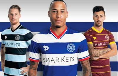
2011/12
2012/13
A bit more thought here with the home kit, which looks much better without the stick-on sponsor. The away efforts are barely worth mentioning.
2013/14
Green shirts, like orange shirts, are a no-no in football. Otherwise, great efforts all round.
2014/15
For some reason, Nike insist that all clubs entering into a partnership with them, have to use their generic shirts for the first season. It's a good job they had a blue and white hooped one then. Nice shade of blue if little else. The away designs won't be remembered for long.
2015/16
No fussing around here, big hoops are back but not as classy as those from 2013/14. Third kit unmemorable.
2016/17
2017/18
All ok, the new sponsor just looks a bit messy, with QPR sadly succumbing to the lure of cash-rich online casinos. Italian mob Errea now the chosen one.
2018/19
Much better from Errea, think the Royal Panda logo and wording should be on different hoops and in different colours, like the KLM days. Black and red hoops have their bi-annual ditching for salmon-pink, which actually looks alright.
2019/20
Hmm, the sponsor still doesn't sit right, otherwise a fairly good offering. I couldn't even begin to describe what colour the away shirt is meant to be, simply awful.
After Royal Panda pulled out of the UK market, another bettting firm - Bet UK - took over in February which improved things slightly for the away shirt.
2020/21
Straightforward design, adorned with the short-lived 'Football Index' sponsor who took all my money I invested in Eberechi Eze with them. Away shirt draws on the design worn at the 1982 FA Cup final.
2021/22
2022/23


No comments:
Post a Comment