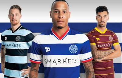
Each season will be updated over time - if you've got a rare match worn shirt or something we've missed out altogether, please send us a picture and we'll add it to that particular season. We're up to date now and will endeavour to continue to add to the seasons as much as we can.
History of QPR kits
A look back at the various kits QPR have worn through the years, starting in season 1973/74.
Welcome
The history of QPR kits is a long and interesting one. Going back to 1882 would be rather time consuming and difficult to be precise about, so this blog starts in 1973/74 when QPR kits started to get more interesting and varied.
2011/12 onwards
2011/12
2012/13
A bit more thought here with the home kit, which looks much better without the stick-on sponsor. The away efforts are barely worth mentioning.
2013/14
Green shirts, like orange shirts, are a no-no in football. Otherwise, great efforts all round.
2014/15
For some reason, Nike insist that all clubs entering into a partnership with them, have to use their generic shirts for the first season. It's a good job they had a blue and white hooped one then. Nice shade of blue if little else. The away designs won't be remembered for long.
2015/16
No fussing around here, big hoops are back but not as classy as those from 2013/14. Third kit unmemorable.
2016/17
2017/18
All ok, the new sponsor just looks a bit messy, with QPR sadly succumbing to the lure of cash-rich online casinos. Italian mob Errea now the chosen one.
2018/19
Much better from Errea, think the Royal Panda logo and wording should be on different hoops and in different colours, like the KLM days. Black and red hoops have their bi-annual ditching for salmon-pink, which actually looks alright.
2019/20
Hmm, the sponsor still doesn't sit right, otherwise a fairly good offering. I couldn't even begin to describe what colour the away shirt is meant to be, simply awful.
After Royal Panda pulled out of the UK market, another bettting firm - Bet UK - took over in February which improved things slightly for the away shirt.
2020/21
Straightforward design, adorned with the short-lived 'Football Index' sponsor who took all my money I invested in Eberechi Eze with them. Away shirt draws on the design worn at the 1982 FA Cup final.
2021/22
2022/23
2010/11
Best effort so far from Lotto. No official logo from Gulf Air either, just their web address.
Nice job with the away kit, but hardly used.
Green and white hoops make a comeback - identical to the home shirt, just don't like the colours.
Good enough for Mr Dog...
2009/10
Much better from Lotto, but the expanse of white at the top doesn't sit well.
Black and red hoops Mk.7, first worn on the final away day of 2008/09 season. Have been better efforts.
The 3rd strip - a bit pointless, like the player.
2008/09
Horrible mess - ghastly new badge, new sponsor (which you can barely make out), grey collar, blue shorts at home. Throw all that into the mix and this is what you end up with. Not a good first effort from Lotto, but guessing under instruction from Flavio Briatore to add as much 'Italian Blue' as possible.
Two away strips this season, neither stands out in the memory.
Preferred the black over the red...
...especially with yellow shorts.
2007/08
Le Coq's final effort after more than 10 years service. Simple design, does the job required.
Another outing for black and red hoops - never fails to disappoint.
2006/07
Red pin-stripping returned for the first time since the Guinness years, complete with new sponsor - Cargiant. Good effort.
Black and red was retained for the away colours, but not in hopped form - a nondescript effort.
2005/06
Much better from Le Coq, but the material used was still very plasticy.
Betty Boo.
5th generation black and red hoops - always looks good.
2004/05
No change at home - the last time QPR had a kit that lasted more than a season.
Simply horrible - the new away kit.
The green and white hoops were still in play as well.
2003/04
The hoops were back to to the right size in an otherwise unmemorable kit. The material used for the replicas was horrible - you could make your own from a Tesco carrier bag. Binatone were now the rather unfashionable sponsors.
A strange offering for the change of kit. Always looked better with black shorts.
A third kit was introduced in March - another stab at green and white hoops, yuck. Not a great season for kits in an otherwise excellent season.
Subscribe to:
Comments (Atom)


